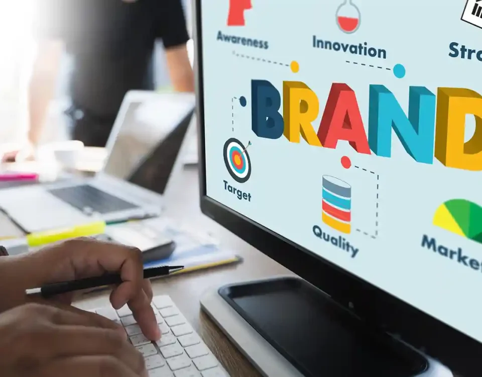
What is brand positioning? Everything You Need to Know
June 30, 2025
Beyond Looks: How AI Changes How People Interact with UX Design
July 4, 2025What is brand positioning? Everything You Need to Know
June 30, 2025Beyond Looks: How AI Changes How People Interact with UX Design
July 4, 2025The Role of Typography and Color Theory in Effective Branding
July 02, 2025
- 17 min to Read
Introduction
You’re likely recalling their signature colors, the way their logos are styled, and even the emotions those visuals trigger. That kind of recognition doesn’t happen by chance — it’s the outcome of thoughtful and strategic brand identity development.
The Institute for Color Research says that people make unconscious decisions about a product within 90 seconds of seeing it, and that up to 90% of that decision is based on color alone.
Typography adds another layer: it's not just what you say, but also how it looks when you say it.
In a world where people scroll past dozens of brands in seconds, it’s often your visual identity — not your words — that gets them to stop and notice.
This blog talks about how typography and color theory can have a big impact on branding and how you can use them to create a brand that connects, converts, and lasts.
The Psychology of Visual Branding
Color and typeface aren't just for looks. They are "functional design elements" based on how people think.
- Typography shows what you mean and how you feel. It's a visual representation of your brand's "voice."
- Color makes people feel things and helps them connect. It's the "emotional shorthand" for what you believe.
When put together carefully, they make a visual identity that feels like a real person—one that your audience will trust and recognize right away. This pair is a must-have whether you're starting a new brand or giving an old one a new look.
How Color Can Help You Remember a Brand
Color doesn't just grab your attention; it burns itself into memory. Based on color alone, people are 80% more likely to remember your brand.
Here are some things that different colors usually mean:
| Color | Emotion/Message | Best For |
|---|---|---|
| 🔴 Red | Energy, urgency, passion | Retail, F&B, entertainment |
| 🔵 Blue | Trust, calm, intelligence | Tech, finance, B2B |
| 🟢 Green | Health, growth, freshness | Wellness, sustainability, finance |
| 🟡 Yellow | Optimism, friendliness | Hospitality, youth brands, services |
| 🟣 Purple | Luxury, imagination, mystique | Beauty, premium goods, creativity |
| ⚫ Black | Sophistication, power | Fashion, luxury, professional brands |
| ⚪ White | Purity, clarity, simplicity | Healthcare, minimalism, tech |
Color Tip: Don't just pick your favorite; pick the one that fits with your brand's values and what your target audience really wants.
How Color and Type Work Together
Think about how a high-end brand would look with Comic Sans in bright orange. Not possible, right?
That's because color and typography work together, not alone. They have to work together to get the right emotional tone.
Some combinations you should stay away from:
- Colors that are too bright and fonts that are too thin don't work well together.
- Colors that are too soft and muted with aggressive display fonts don't match the mood.
- The text and background don't have enough contrast, which makes it hard to read
Examples of Real-World Branding That Work
Let's look at some brands that are great at communicating visually:
Spotify- Electric green and a sans-serif font.
- Shows modernity, movement, and energy.
- Serif font and the famous teal blue.
- Classic, high-end, and unmistakably elegant.
- Rounded sans-serif font and soft colors.
- Friendly, welcoming, and open to everyone.
How to Pick the Best Visual Identity for Your Brand
Here's a useful structure you can use:
1. Understand the Personality of Your Brand
Before choosing any colors or fonts, define your brand’s essence. What kind of personality does your brand carry?
- Are you bold, energetic, and disruptive — challenging norms?
- Or are you soft-spoken, nurturing, and people-first?
- Maybe you’re sleek and futuristic, grounded in technology and innovation?
Think of your brand as a person. If it walked into a room, how would it speak? What would it wear? Would it inspire, empower, or reassure? This emotional foundation will guide all design decisions — from typography weight to color tone.
Tip: Create 3–5 brand personality traits (e.g., “minimal,” “confident,” “optimistic”) to anchor your design direction.
2. Figure Out What Makes Your Audience Feel Things
Your brand exists to serve your audience — so their emotional triggers matter.
- Do your customers need to feel safe and assured (e.g., in finance or healthcare)?
- Are they looking for adventure, freedom, or excitement (e.g., in travel or fitness)?
- Do they crave luxury, beauty, or self-expression (e.g., in lifestyle or fashion)?
Use empathy to understand what your visuals need to communicate. The wrong tone — even if beautiful — can completely disconnect you from the people you're trying to reach.
Tip: Research your ideal customer’s lifestyle, aspirations, and fears. Design for what they want to feel, not just what you want to say.
3. Pick Colors and Fonts That Go Well Together
Now that you know your brand and audience, it’s time to translate that into visuals.
- Colors: Choose 1 primary color that reflects your brand's energy, 1–2 secondary colors for depth and contrast, and 1–2 neutrals for background or utility.
- Fonts: Select a font pairing that balances expression and function. For example:
→ A bold serif for authority + a light sans-serif for readability.
→ A rounded sans-serif for friendliness + a neutral font for clarity.
Make sure your color palette and typography are consistent with your personality and scalable across devices, print, and platforms.
Tip: Use online tools like Coolors, Adobe Color, or Fontpair to test combinations before locking them in.
4. Make a System That Can Grow
Strong brands aren’t just built on beautiful logos — they rely on design systems.
- Create a visual language that works across digital, print, and packaging.
- Define rules for logo usage, spacing, icon styles, image treatments, font sizes, etc.
- Make sure your team or collaborators can apply your branding consistently in everything from email templates to social media posts.
Clear guidelines help keep your brand looking consistent — no matter how big your business gets or where it shows up.
Tip: Build a brand style guide — even a simple one — to document your visual choices and standards.
5. Try It Out With Your Users
Design is never final — it evolves as your audience grows, their preferences shift, and your brand adapts to stay relevant.
- Conduct small tests (A/B visuals in ads, website hero section experiments).
- Gather qualitative feedback: Do people feel what you want them to feel when they see your brand?
- Track behavior: Are bounce rates, time on page, or conversion metrics shifting after a visual rebrand?
Use feedback as fuel — evolve your visual identity based on real-world response, not guesswork.
Tip: Revisit your branding every 12–18 months to ensure it's still aligned with your growth, audience, and market relevance.
Section 7: Things You Shouldn't Do
- Using trendy fonts without checking to see if they are easy to read
- Mixing too many typefaces or color styles
- Picking colors without thinking about how they might affect different cultures
- Not paying attention to contrast and accessibility for visually impaired users
- Not using the same fonts across all channels
Conclusion: Use Upclues to Make Your Brand Stand Out Visually
The best branding doesn't yell; it speaks with quiet confidence. It invites you in, keeps you interested, and stays with you long after the first impression. And that power comes from using typography and color theory on purpose.
At Upclues, we think that branding is more than just a logo; it's a whole system. Our brand development services in california are made to help new and growing businesses create brands that look good, feel good, and work across all touchpoints.
Our team makes strategic visual systems that connect, convert, and grow with you, whether you're starting from scratch or improving an existing identity.