How Strong Hospital Branding Influences Patient Decisions
July 19, 2025
Why Partnering with a Rebranding Agency Is the Smartest Move for Growth
July 23, 2025How Strong Hospital Branding Influences Patient Decisions
July 19, 2025Why Partnering with a Rebranding Agency Is the Smartest Move for Growth
July 23, 2025Top SaaS Website Designs to Inspire Your Next Project
July 21, 2025
- 18 min to Read
Introduction
When it comes to SaaS businesses, your website is more than just a place to host information — it’s the very front line of customer experience.
It’s where first impressions are formed, demos are booked, and decisions are made.
What makes some SaaS websites more effective than others?
The answer is simple: clarity, great storytelling, and thoughtful design. A well-built SaaS website design communicates value quickly, builds trust effortlessly, and invites the visitor to take meaningful action.
In this article, we’ll explore 20 inspiring SaaS website designs — 10 standout examples from well-known brands and 10 underrated gems you might not have seen.
Whether you’re a startup founder, product designer, or part of a growing team, this curated list will give you real-world inspiration for what works, what engages, and what sets great SaaS websites apart.
What Makes a Great SaaS Website?
Before we dive into examples, let’s first outline what truly makes a SaaS website effective:.
✅ Clear Value Proposition
Users should know exactly what your product does within the first few seconds of landing on your site.
✅ Seamless User Flow
Navigation should be intuitive. The journey from landing to conversion should feel natural and effortless.
✅ Product-First Visuals
From animated demos to real product screenshots, visuals should complement (not replace) messaging.
✅ Optimized for Conversions
Every key page — homepage, pricing, demo — should guide visitors toward action.
✅ Performance and Mobile Experience
Your website should load fast, look great on all devices, and feel snappy to use.
Now let’s jump into the list — starting with some popular inspirations.
Top 10 Best SaaS Websites
A great SaaS website helps users understand the product quickly and take action with ease. It has a clean layout, clear messaging, and simple navigation.
In this section, we’ve listed 10 of the best SaaS websites that do all of this really well. These examples show how good design and smart content can turn visitors into customers.
1. EverAfter
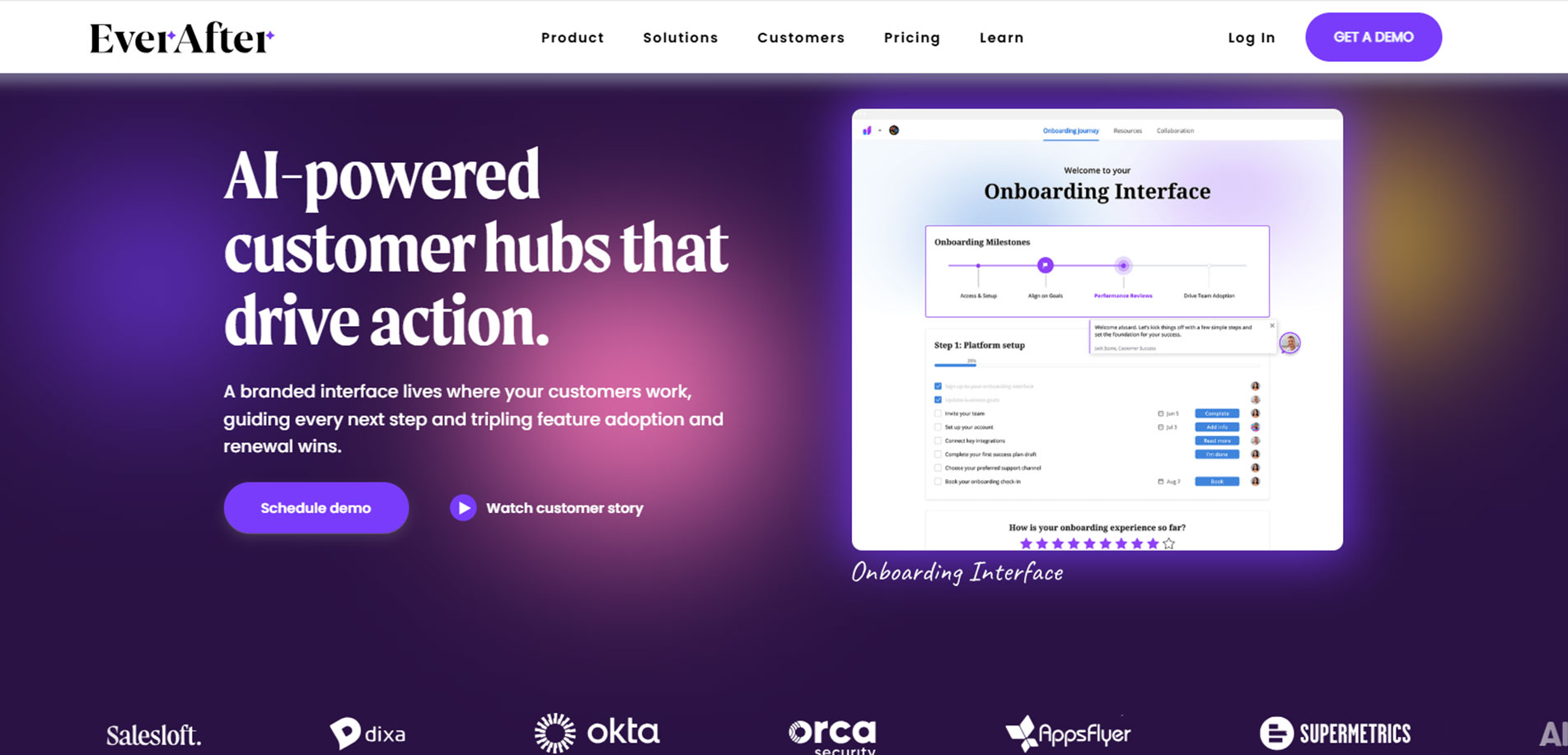
Website: everafter.ai
A customer-facing workspace platform with a modern, story-driven website that brings user experience, collaboration, and onboarding to life beautifully.
Key Highlights:
- Scroll-based storytelling that mimics user journey
- Visually rich dashboard previews with context
- Personalized content based on use cases
2. Linear
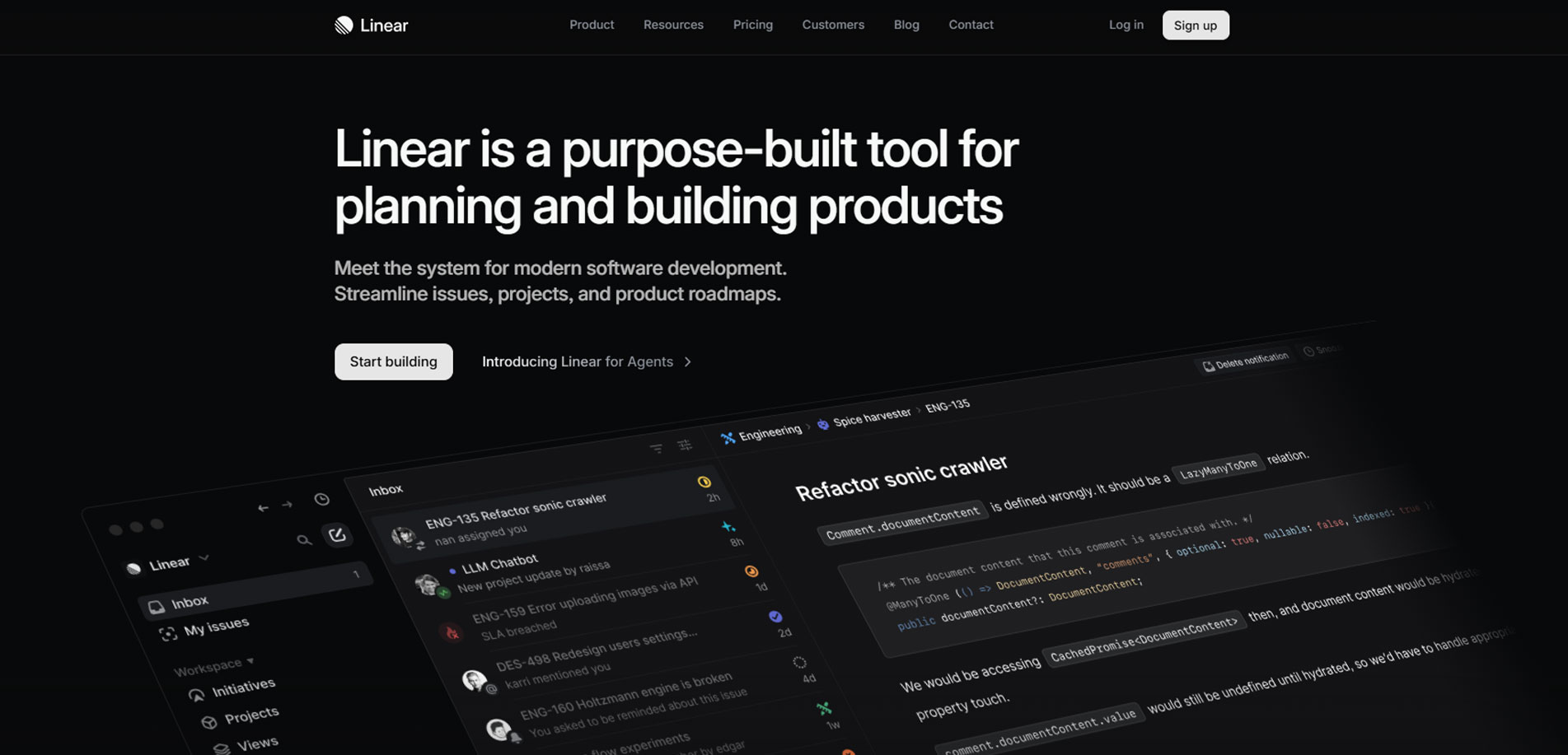
Website: linear.app
A sleek issue-tracking tool with a performance-driven, ultra-minimal website that reflects its speed, elegance, and developer-focused design philosophy.
Key Highlights:
- Light/dark themes that echo the product UI
- Strong visual hierarchy and crisp typography
- Fast-loading design that mirrors product performance
3. June.so
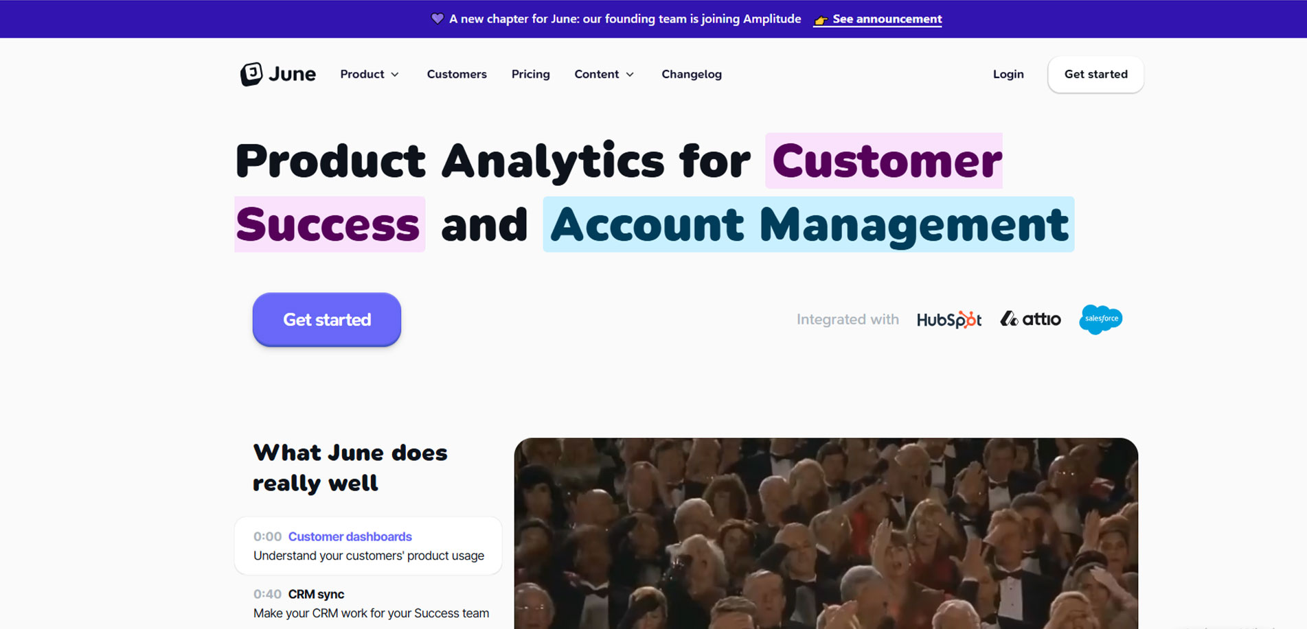
Website: june.so
A product analytics platform with a fresh, colorful website showcasing real dashboards, easy use cases, and vibrant user-first design.
Key Highlights:
- Bright gradients and soft rounded visuals
- Real-time UI examples on every scroll
- Simple copy with big impact
4. Notion
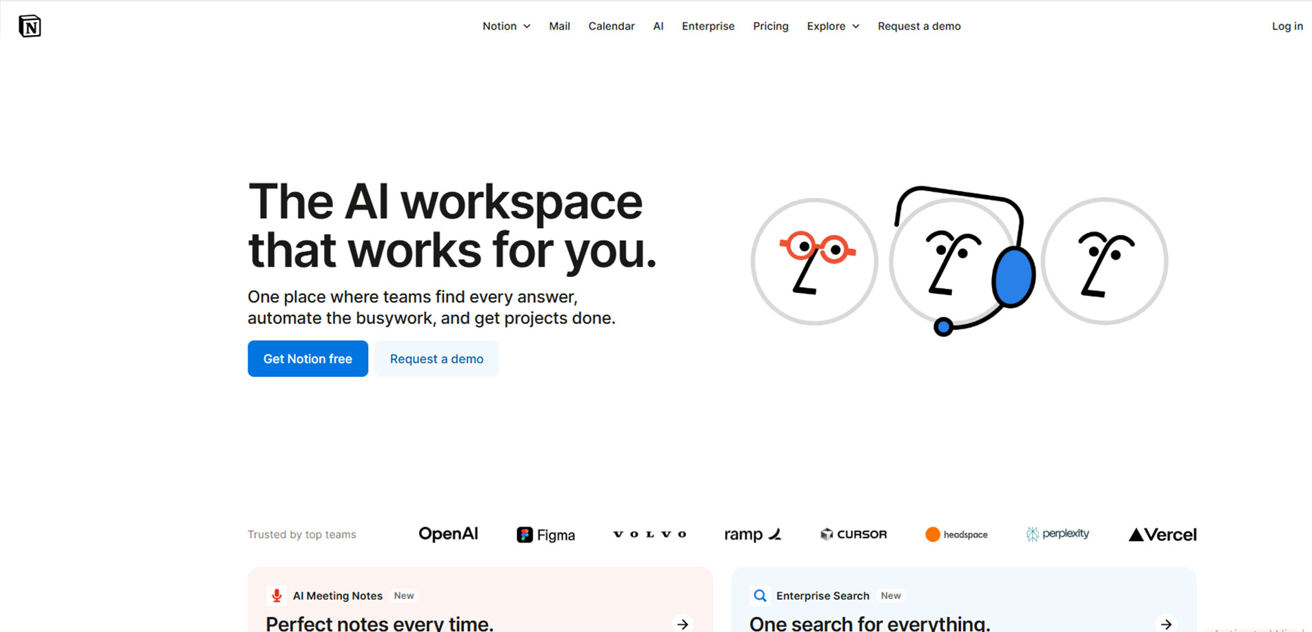
Website: notion.so
All-in-one workspace with a clean, modular site that speaks to teams and individuals through simplicity, smart visuals, and functional storytelling.
Key Highlights:
- Modular blocks and use-case segmentation
- Minimal layout with soft animations
- Custom illustrations for every persona
5. Levity
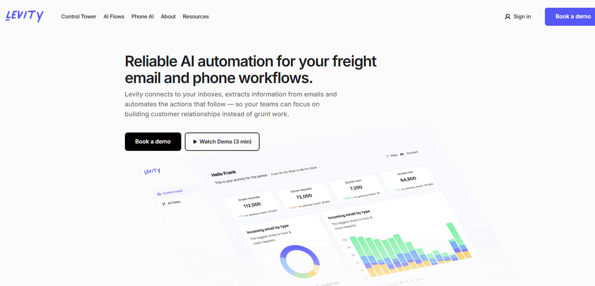
Website: levity.ai
Levity’s AI-powered automation tool uses a soft, human-friendly website experience that makes advanced tech feel accessible and relatable.
Key Highlights:
- Calming colors and curved visual sections
- Real-world use cases made visual
- AI explained with human-first messaging
6. Copy.ai
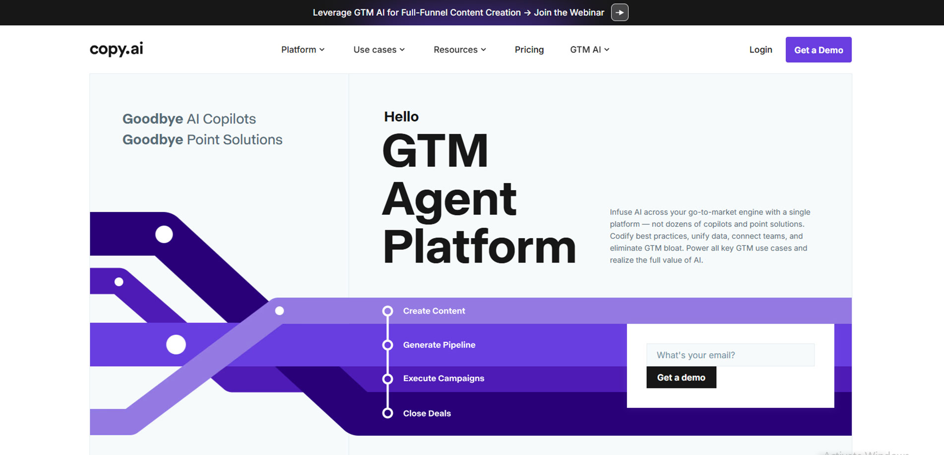
Website: copy.ai
A smart copywriting assistant with a bold, conversion-focused website offering immediate engagement through demo previews and clear user flows.
Key Highlights:
- Interactive try-it-now feature above the fold
- Colorful CTAs with product use cases
- Focused on speed and simplicity
7. Typedream
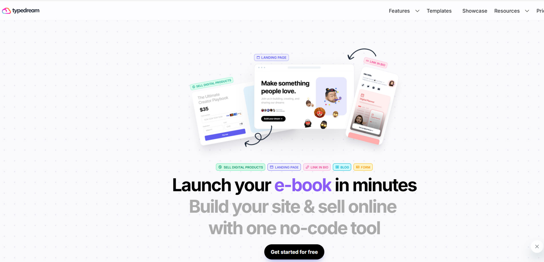
Website: typedream.com
Website builder for creators and indie makers, designed with personality, clear walkthroughs, and a community-friendly tone of voice.
Key Highlights:
- Fun, friendly UI blocks throughout the page
- Straightforward onboarding visuals
- Honest copy and clear pricing
8. Cal.com
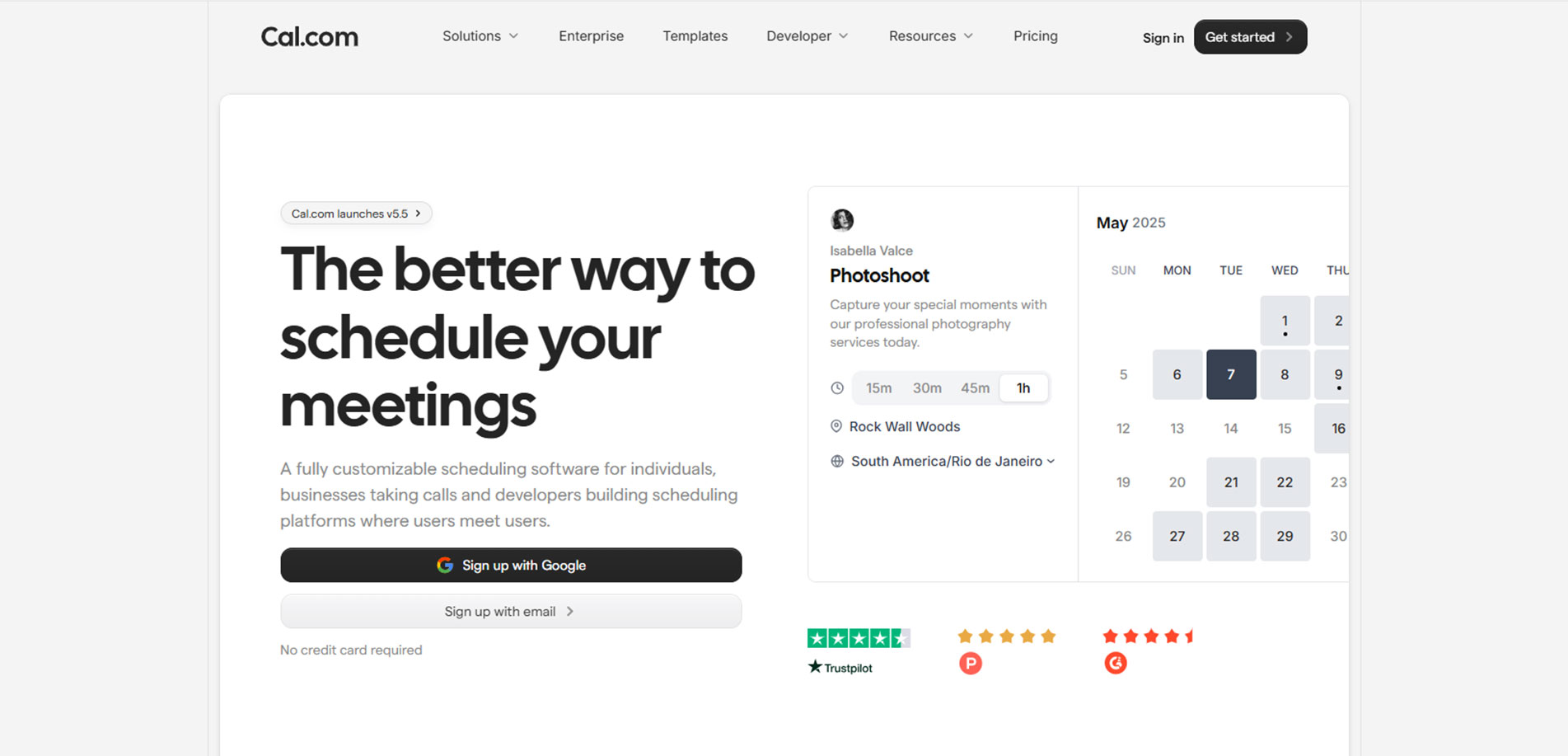
Website: cal.com
A customizable open-source scheduling tool with a tech-focused design, showcasing developer transparency and real-time product interactions.
Key Highlights:
- Developer-centric with embedded code examples
- Clean, black-and-white design aesthetic
- Live booking demos on homepage
10 Underrated But Brilliant SaaS Website Designs
When you think of the best SaaS websites, names like Slack, Notion, or Dropbox likely come to mind. While these giants have undeniably mastered design and usability, there’s a quieter group of SaaS companies delivering equally brilliant website experiences — just without the limelight.
This article explores 10 underrated SaaS website designs that are thoughtful, creative, and conversion-friendly. Whether you’re a designer, marketer, or founder planning your next project, these examples can offer unexpected inspiration.
Let’s get into it.
1. Qovery
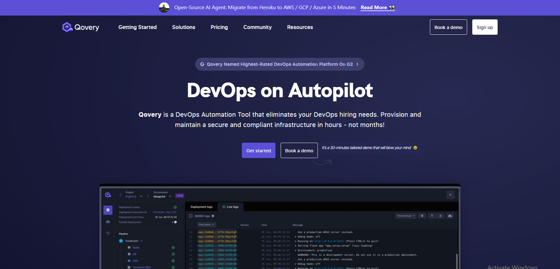
Developer-first design with bold, confident UX
Built for developers, Qovery’s deployment platform is matched by a website that nails the balance between form and function.
- Dark-themed UI that reflects the product’s developer focus
- Clear CTAs like “Start Free” and “Request a Demo”
- Live code animations and a clean, monospaced font palette
- Testimonials and client logos build credibility early
Instead of flashy motion graphics, Qovery’s website impresses through usability and confidence. It’s a great SaaS website design model for developer-centric tools.
2. Wized
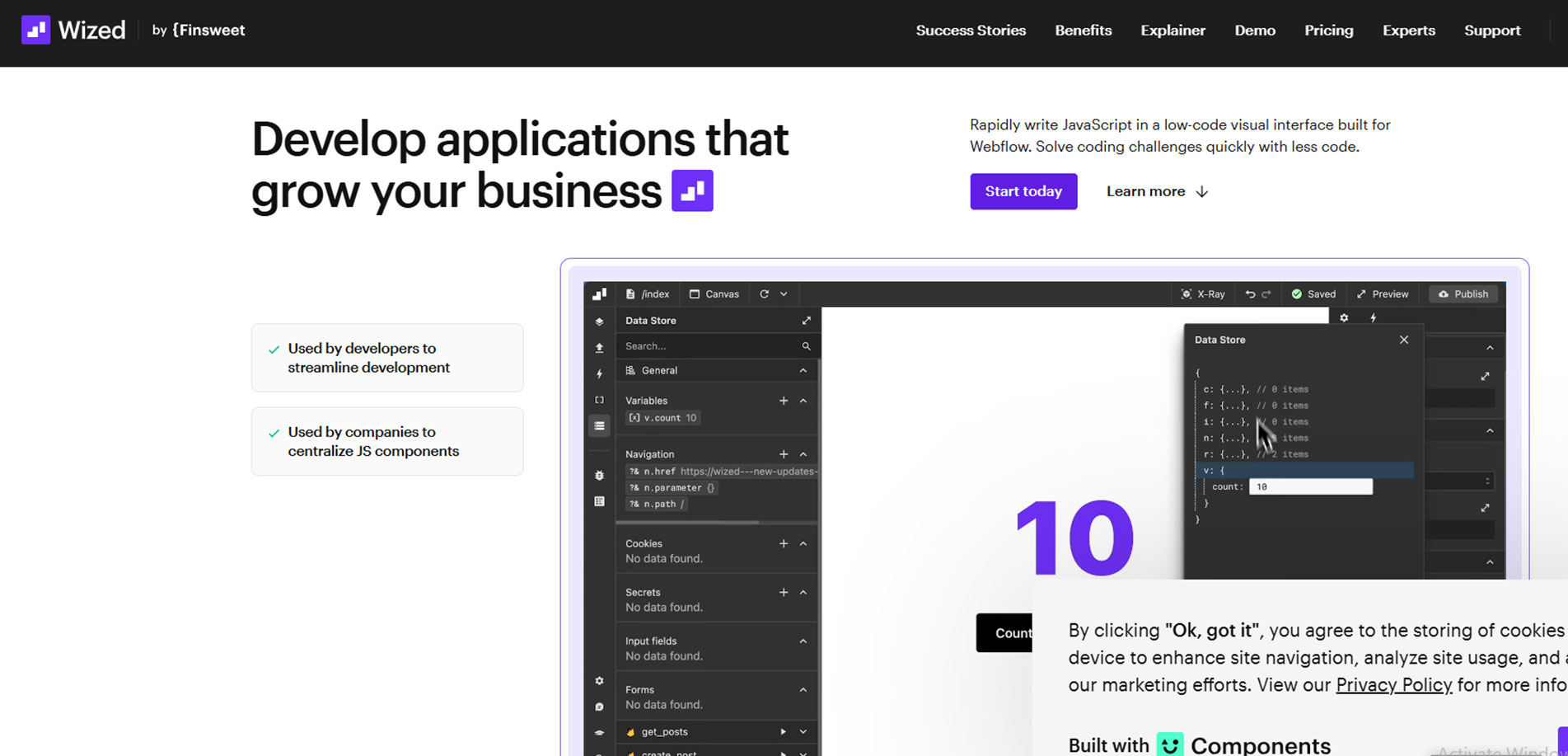
A no-code platform that brings interaction to life
Wized is for building dynamic web apps without code. And the site? It’s a designer’s dream.
- Scroll-based storytelling
- Fluid animations that explain the product
- Video walkthroughs for visual learners
- Intuitive navigation with microinteractions
Wized does a fantastic job showing — not telling — what the platform is capable of. Its saas website design is educational and inspiring.
3. Raycast
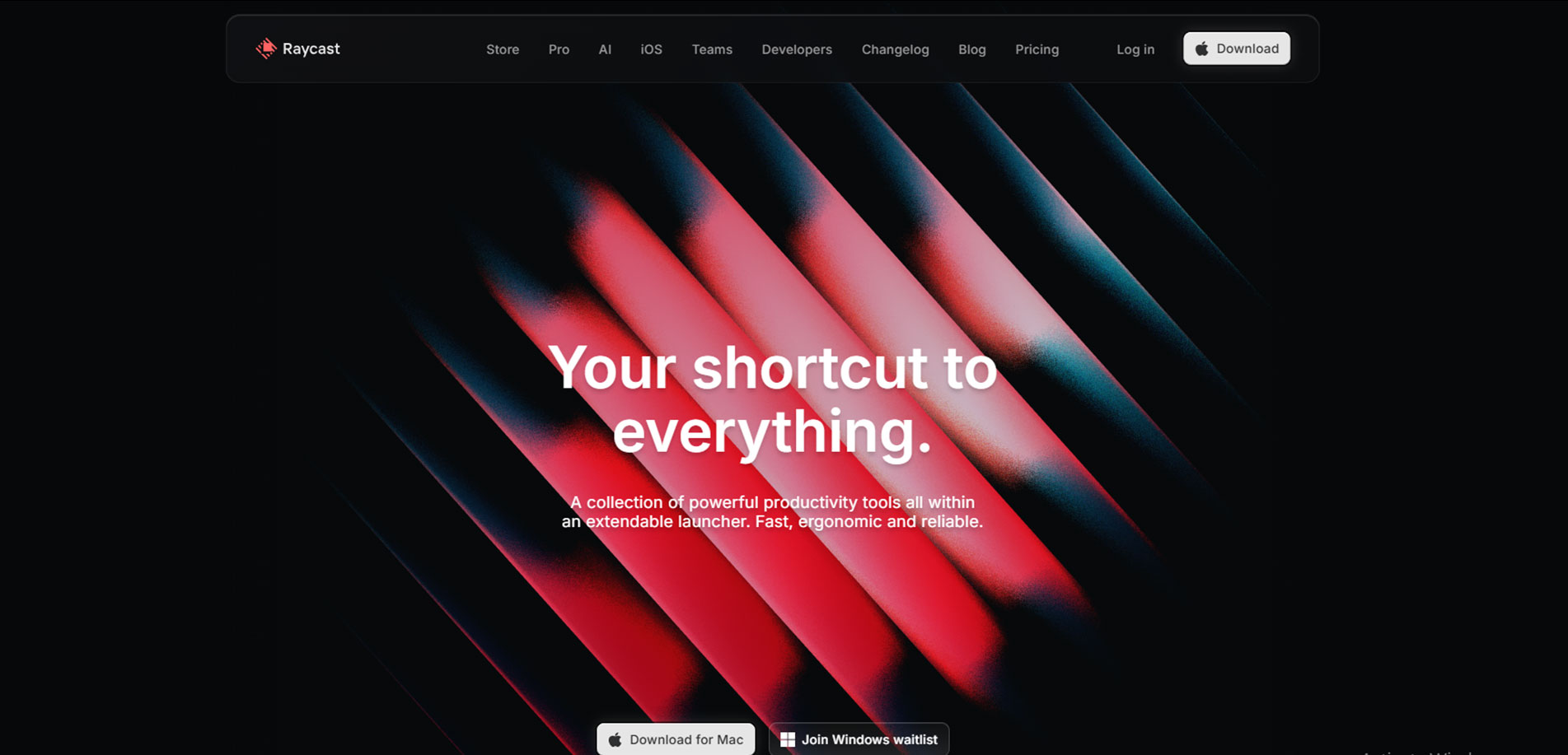
Beautiful functionality meets product showcase
Raycast is a productivity booster for developers, and their website balances slick visuals with product depth.
- A clean dark mode UI with vibrant highlights
- App showcase animations that show real-time usage
- Minimal copy focused on benefits
- Efficient page loading and intuitive nav
It feels like a product made by people who use the product — which is why it resonates so deeply with its target audience.
4. Plain
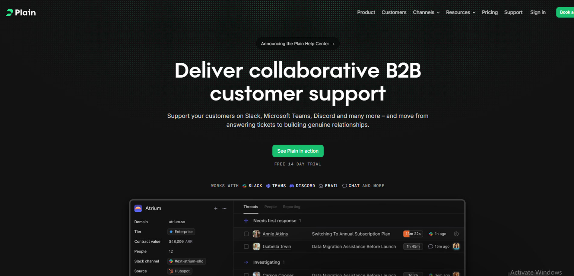
Support tool with a refined, thoughtful layout
Plain is a customer support platform — but its site feels like it came from a luxury tech brand.
- Custom typography and muted color palette
- Bold, minimal layout with storytelling elements
- Subtle parallax and hover animations
- Copy that speaks with the user, not at them
This is a great example of how tone and layout can make support software feel premium.
5. Uizard
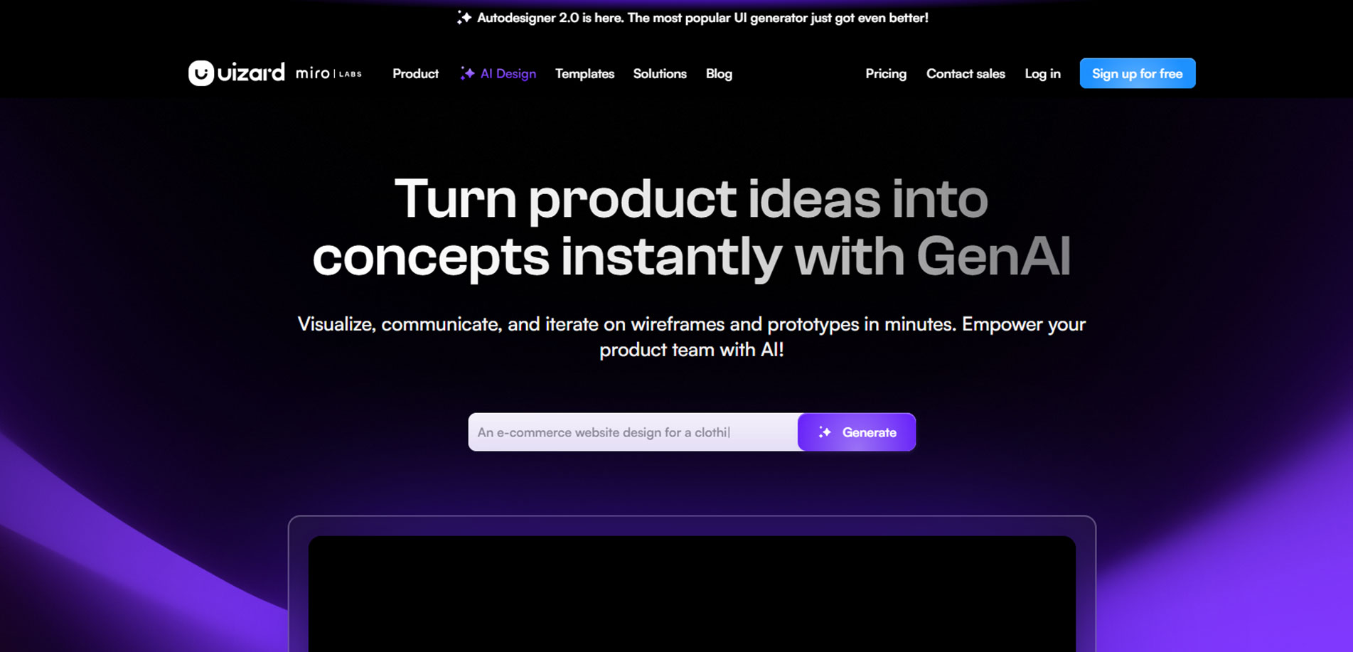
Playful UX for non-designers
Uizard helps teams create mockups without design skills. Their site invites all users with:
- A friendly color palette and rounded UI
- Illustrations that feel inclusive and fun
- Interactive examples of mockup workflows
- Instant visual feedback during exploration
Uizard blends accessibility and design beautifully — proof that simplicity can also feel premium.
6. Cycle
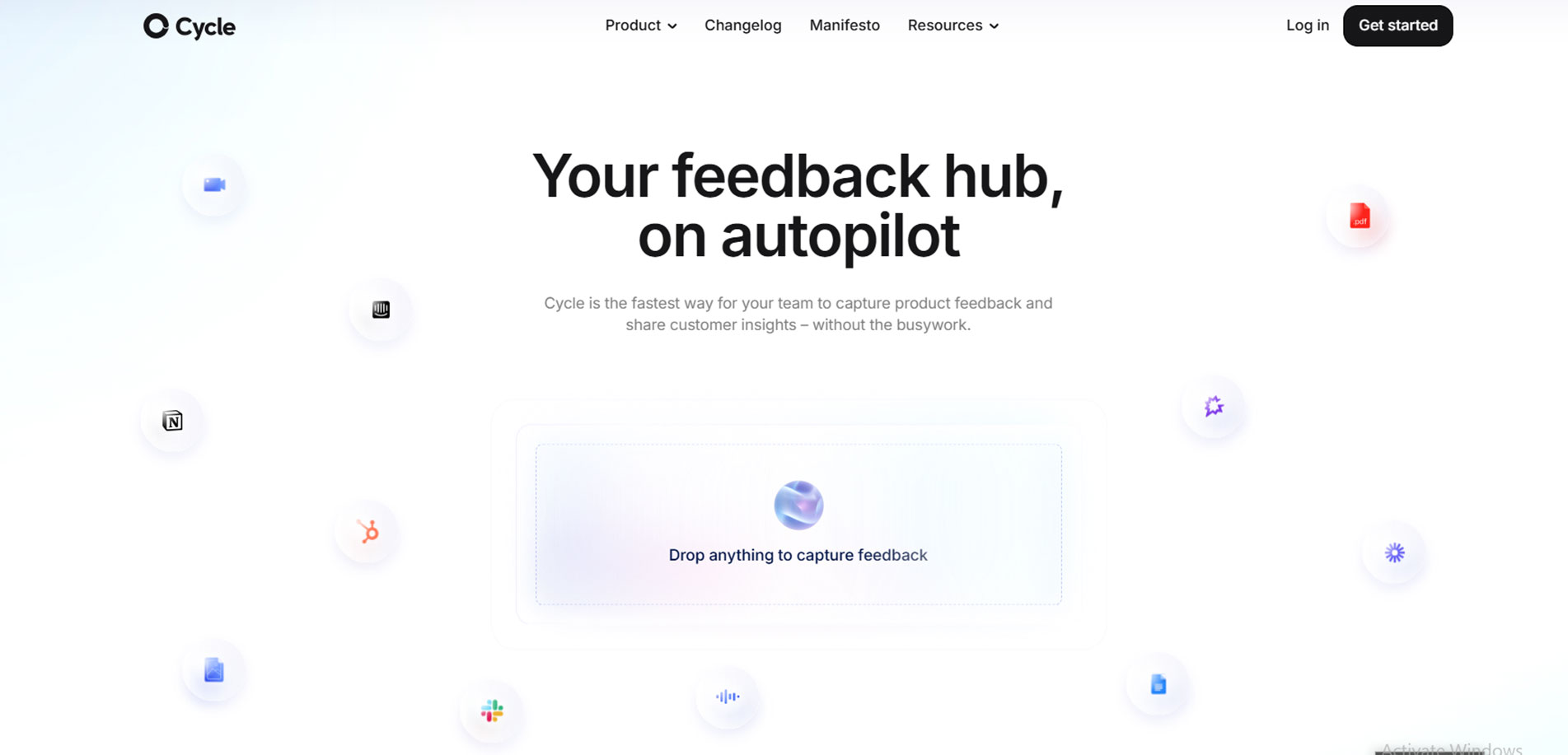
Sleek design meets product depth
Cycle is a product collaboration tool, and its website is refreshingly straightforward.
- Dynamic product demo embedded on homepage
- Use of scroll-based storytelling to highlight features
- Detailed pricing and use-case breakdowns
- Minimalist, modular layout with strong hierarchy
Cycle’s site doesn't try too hard. It simply leads you through the product in the most natural way.
7. PostHog
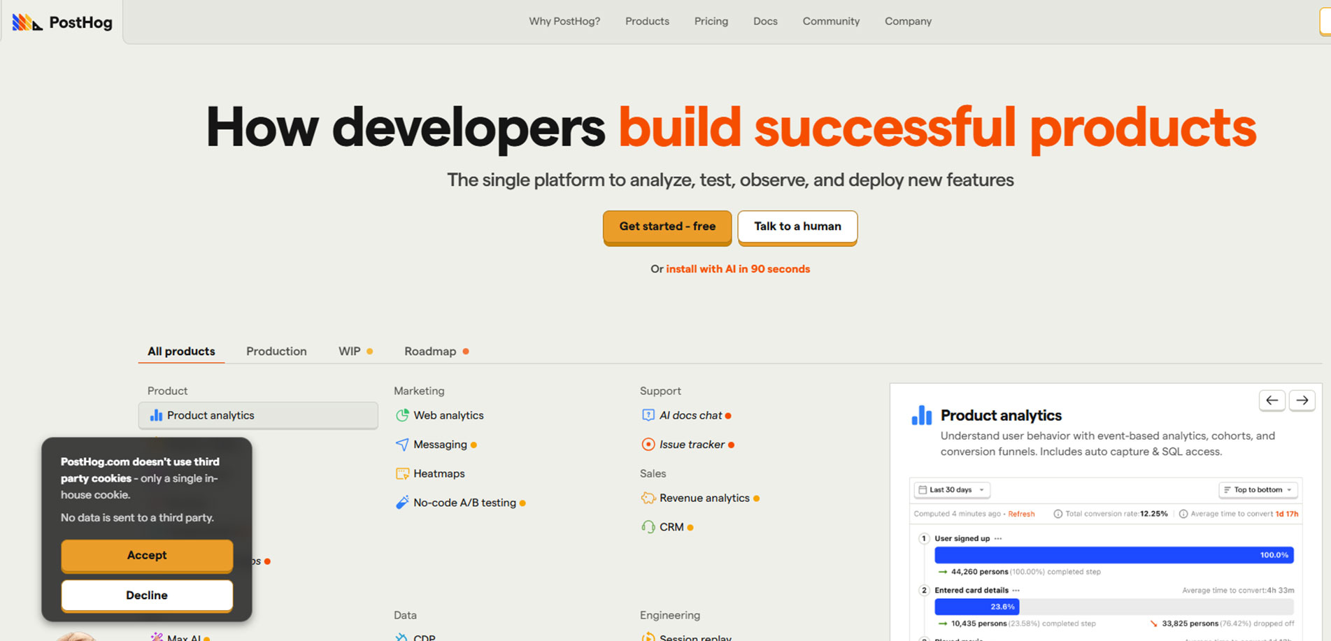
Developer-led design without the fluff
PostHog is an open-source product analytics tool. Their site is not overly polished — but that’s the point.
- Custom illustrations and hand-drawn style elements
- Developer-first navigation and tone
- Clear, honest pricing pages
- Focus on open-source contribution
PostHog breaks the “corporate SaaS” mold and leads with purpose, authenticity, and community.
8. Plausible
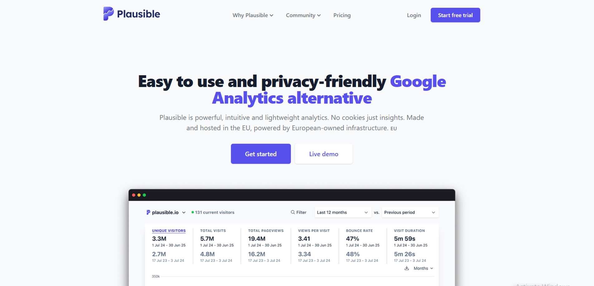
Privacy-focused design with clear messaging
Plausible is a privacy-first analytics tool. Their site delivers crisp messaging with:
- No trackers — so it loads blazing fast
- Direct copy: “Simple and privacy-friendly Google Analytics alternative”
- Open-source transparency throughout
- Clean visuals and modular layout
This site is minimal, fast, and aligned with its values — a top-tier example for lean SaaS teams.
What These Hidden-Gem SaaS Websites Teach Us
Across these 10 underrated SaaS website designs, there’s a pattern of clarity, utility, and personality. You don’t need to be a big name to create an effective website — just follow these takeaways:
- Prioritize storytelling over buzzwords
- Use product visuals over long-winded feature lists
- Create sections that guide the user journey (not just a pretty scroll)
- Keep CTAs consistent and visible
- Don’t be afraid to let your brand voice shine
Final Thoughts — Ready to Build Your SaaS Website?
A strong SaaS website is more than just good design. It helps users understand your product, builds trust, and makes it easy for them to take action.
The examples we shared—both popular and underrated—show how thoughtful design can make a big difference. Clean layouts, clear messaging, and smooth user flow are key to a successful SaaS website.
If you're planning to build or improve your own SaaS site, take these ideas as inspiration.
And if you need expert support, Upclues – SaaS Website Design Agency is here to help. We design SaaS websites that not only look great but also work well for your users and your business.
Let’s create something meaningful, together.