10 Reasons to Hire a Dedicated WordPress Developer for Your Next Website Revamp
June 18, 2025
Brand Strategy vs. Marketing Strategy: Why the Difference Matters
June 21, 202510 Reasons to Hire a Dedicated WordPress Developer for Your Next Website Revamp
June 18, 2025Brand Strategy vs. Marketing Strategy: Why the Difference Matters
June 21, 2025Why Your SaaS Website Matters More Than You Think
June 20, 2025
- 19 min to Read
Introduction
75% of users judge a company’s credibility based on its website, and over 50% of all web traffic comes from mobile devices. Your website isn’t just a touchpoint—it’s often the first (and only) chance to make a lasting impression.
It’s where users discover your product, explore what it offers, and decide whether to Start a Free Trial or Schedule a Demo. A strong SaaS website builds trust fast, communicates value clearly, and drives action.
But even small missteps—confusing layouts, vague messaging, slow load times—can quietly drive users away.
This article outlines the most common SaaS website design mistakes that hurt conversions and provides actionable fixes. Whether you're refreshing your current site or building from scratch, these insights will help you create a smoother, more effective user experience.
1. Weak Above-the-Fold Content
The area visitors see first when they land on your homepage is critical. If the main headline doesn’t clearly explain what your product does, people may leave immediately.
Signs of a weak start:
- Headlines that are too vague or full of buzzwords
- No mention of the problem you solve
- Missing or unclear call-to-action (CTA)
- Generic visuals
How to improve it:
- Write a simple, clear headline focused on user benefit
- Add a short description explaining what your product does
- Include one clear CTA like "Try Free for 14 Days"
- Use real product screenshots or a quick demo video
2. Complicated or Overloaded Navigation
Visitors should be able to find key information easily. Complex menus can make people feel lost.
Common issues:
- Too many links in the top menu
- Dropdowns within dropdowns
- Confusing labels that don’t describe the content
Better approach:
- Use a simple menu with 5–6 main items
- Group related content logically
- Use clear, familiar labels like Features, Pricing, About
3. Missing or Weak CTAs
Without strong CTAs, users might read your content but not know what to do next.
Common CTA mistakes:
- Only one CTA on the whole page
- Buttons that say "Click Here" or "Learn More"
- Poor color contrast that hides the button
What to do instead:
- Drives action with Start Free Trial or Schedule Demo.
- Place CTAs after important sections
- Make buttons stand out with color and spacing
4. Focusing Only on Features, Not Benefits
Highlighting features is helpful—but showing real benefits wins attention.
Why this matters:
- Features say what the product does
- Benefits explain why that matters to the user
Better way to present it:
- Combine each feature with a user benefit
- Example: "Real-time Reports" becomes "Save hours by getting real-time reports with one click"
5. Slow Loading Speeds
People don’t like waiting. A slow website can cause visitors to leave before they even see what you offer.
What slows sites down:
- Large, uncompressed images
- Too many plugins or scripts
- No caching system in place
How to speed it up:
- Optimize and compress images
- Minify code (HTML, CSS, JS)
- Use a content delivery network (CDN)
6. Poor Mobile Experience
Over 50% of website visitors are on mobile.If your SaaS website design doesn’t work well on phones or tablets, you lose potential users.
Common mobile issues:
- Text too small to read
- Buttons hard to tap
- Layout problems
How to fix it:
- Use a responsive layout that adjusts to screen sizes
- Make buttons large and easy to click
- Test your site on different devices
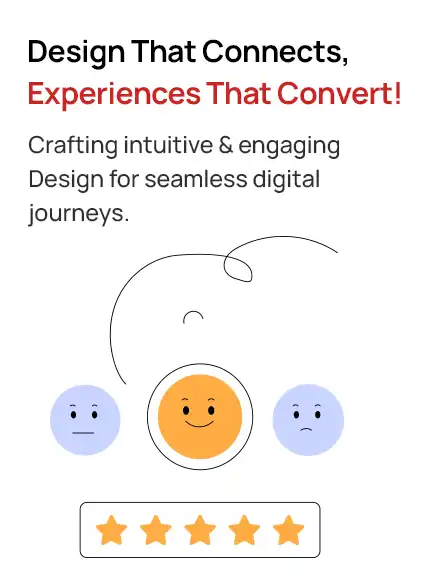
7. Missing Social Proof or Trust Elements
New visitors want proof your product works—and that others trust it.
What’s often missing:
- Customer testimonials
- Client logos or user numbers
- Trust badges or review scores
Add social proof by:
- Showing a few real customer quotes with names and photos
- Listing well-known clients or partners
- Linking to 3rd-party reviews like G2 or Trustpilot
8. Long or Complicated Signup Forms
Long forms can stop people from signing up. Users want quick and easy ways to get started.
Problems to avoid:
- Asking for too many details upfront
- No social login options
- No feedback if a field has an error
Simplify the process:
- Ask only what’s necessary (email + password is often enough)
- Offer Google or LinkedIn sign-in
- Display real-time error messages as users complete the form.
9. Overwhelming Pages With Too Much Text
Large blocks of text are hard to scan. Users may get bored or confused.
Avoid this by:
- Breaking up content with headers and bullet points
- Using images or icons to support your message
- Writing short paragraphs with clear language
10. Unclear or Missing Pricing Page
People want to know how much your product costs. Hiding pricing creates frustration.
Problems:
- No pricing page at all
- Confusing or hard-to-compare plans
- Lack of plan details
Better strategy:
- Show pricing tiers with simple plan names
- List what’s included in each tier
- Add toggle for monthly/annual plans
- Include a CTA under each plan
11. Ignoring Basic SEO
Even the best-designed site won’t help if no one can find it.
Common SEO gaps:
- No keyword optimization
- Missing page titles or descriptions
- Images without alt text
How to fix it:
- Use keywords in headings and page copy
- Create distinct meta titles and descriptions for every page.
- Add alt text to all images
12. No Analytics or Tracking Setup
If you’re not tracking user behavior, you’re guessing what works.
What to use:
- Google Analytics or GA4 for site traffic
- Hotjar or Microsoft Clarity for user behavior
- Track signups, button clicks, and drop-offs
Benefits:
- Know what pages are performing well
- Spot where users drop off
- Make decisions based on real data
13. Inconsistent Branding and Design
A mismatched design can make your product feel unprofessional.
What consistency looks like:
- Same font styles across pages
- Matching button shapes and colors
- Clear visual identity (colors, icons, layout)
How to get there:
- Create a simple style guide
- Use a design system or UI kit
- Apply consistent rules sitewide
14. Hiding the Product
People want to see the product before they sign up. If you only use text, users may not understand what your SaaS does.
Fix this by:
- Adding product screenshots or video demos
- Showing the dashboard or key features in action
- Offering an interactive preview or sandbox demo
15. One-Size-Fits-All Content
Different users have different needs. A generic homepage may not speak directly to any audience.
What to do instead:
- Personalize messages based on traffic source or user type
- Show case studies or solutions by industry or company size
Example: Startups may need flexible pricing, while enterprises want security and integrations.
Conclusion: Remove Friction, Focus on the User Experience
Improving your SaaS website design means helping users find what they need, understand your value, and take action. Small issues in layout, navigation, content, or mobile performance can quietly reduce conversions—but every one of them can be fixed.
Effective SaaS website design is clear, fast, and easy to use. It’s built with the user in mind, guiding them toward actions like Start Free Trial or Schedule a Demo without confusion or friction.
Upclues is a SaaS website design agency focused on clarity, speed, and trust—because that’s what users respond to. Whether you're refining your current site or launching something new, focus on clarity, speed, and trust to build a website that converts.
Smarter Websites for Better SaaS Growth
We craft clean, fast, and conversion-optimized websites tailored for SaaS growth.