
Responsive Web Design Services
That Deliver Stunning User Experiences on Every Device
Your customers visit your website from desktops, tablets, and smartphones-and they expect a flawless experience every time. Our responsive web design services ensure your website automatically adapts to any screen size, providing fast performance, intuitive navigation, and a consistent user experience across all devices.
At Upclues, we create mobile-friendly, conversion-focused websites that help businesses improve engagement, reduce bounce rates, and turn more visitors into customers. Build a website that looks great, performs better, and grows your business on every screen.

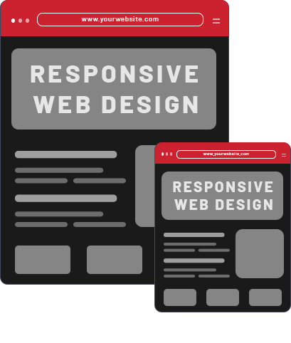
What is Responsive Web Design?
Think about how many different devices you use in a single day. You might load a website on your phone while waiting in line, open it on a laptop at the office, and browse it on a tablet at home. If that website is hard to read, makes you pinch to zoom, or forces you to scroll sideways, you are probably going to leave and find a competitor.
That specific frustration is exactly the problem responsive web design solves.
In simple terms, responsive web design is an approach to building websites that automatically adapt to fit the screen size of any device. Instead of creating one separate site for mobile phones and another for desktop computers, a responsive site uses fluid, flexible layouts. The text, images, videos, and navigation menus naturally shrink, grow, or rearrange themselves so they always look right.
When you utilize professional responsive website services, you ensure your platform delivers a smooth, readable experience for everyone. Plus, search engines actively prioritize mobile-friendly sites. By having a single site that responds perfectly to the user's screen, you are not just keeping your human visitors happy; you are also giving your website a massive advantage in search rankings.
What happens if your website isn't responsive enough?
Ignoring the need for a flexible layout directly hurts your business. Sticking with an outdated, rigid design leads to:- Frustrated visitors and high bounce rates:
If users have to squint to read your text or repeatedly tap the wrong tiny link, they won’t stick around. They will simply hit the "back" button and visit a competitor whose site actually works on their phone.
- A massive drop in search engine rankings:
Search engines actively penalize sites that aren't mobile-friendly. Even if your content is fantastic, a non-responsive layout means your business will struggle to show up when people search for your services.
- Lost sales and missed leads:
A clunky mobile checkout process or an unreadable contact form directly hurts your bottom line. If it is hard for a customer to get in touch or make a purchase on their tablet or phone, they simply won't bother.
- Damage to your brand's reputation:
Your website is often the first impression a customer has of your company. An outdated, desktop-only site makes your business look like it is stuck in the past and out of touch with modern customer needs.
When you utilize professional responsive website services, you avoid these pitfalls. You ensure your platform delivers a smooth, readable experience for everyone, keeping your human visitors happy and giving your website a massive advantage in search rankings.
Comprehensive Responsive Web Design Services We Offer
Building a website that looks great on a laptop is only half the battle. To truly capture your audience's attention and keep them engaged, your site needs to perform beautifully across every single device they use. At Upclues, our Responsive Web Design services are engineered to guarantee a flawless, high-converting user experience from the moment a visitor lands on your page.
Here is exactly what our comprehensive approach includes:
Fluid Grid Layout Design:
Flexible Images and Media Configuration:
CSS Media Queries Implementation:
Mobile-First UI/UX Design:
Conversion Rate Optimization (CRO):
Cross-Browser and Device Testing:
Why Choose Upclues as Your Responsive Website Design Company?
Finding the ideal digital partner can often seem like looking for a needle in a haystack. You require more than just a vendor who will create a website and leave; you need a team that truly comprehends your business objectives, honors your timeline, and knows how to engage with your audience.
At Upclues, we know that creating the best responsive design websites requires more than just making a page fit on a phone screen. It requires a deep understanding of user psychology, modern web architecture, and your unique brand identity. When you invest in our Responsive Web Design services, you are choosing a dedicated team focused on turning your digital presence into a measurable growth engine.
Here is exactly why businesses trust Upclues as their go-to responsive website design agency:

Custom-Crafted Digital Experiences
Performance and SEO at the Core:
Transparent Communication, Zero Tech Jargon:
Future-Proof Scalability:
Comprehensive, End-to-End Support:
Stop losing potential customers to a clunky, outdated, or frustrating mobile experience. Partner with Upclues and let us build a flexible, high-performing digital storefront that works exactly as hard as you do.
Start Your Brand Transformation Today
Boost your business identity with Upclues’ customized brand development services in California, crafted to increase visibility and accelerate long-term growth. Fill out the form below and begin your brand transformation today.


Get in Touch - We’d Love to Hear from You!
Our Proven Process for Responsive Web Design Services
Embarking on a new website project can often feel overwhelming. It is entirely normal to worry about missed deadlines, technical miscommunications, or ending up with a site that looks broken on a smartphone. We understand those frustrations, which is why we eliminate the guesswork.
At Upclues, we know that delivering the best responsive design websites requires more than just good coding; it requires a disciplined, transparent, and highly structured roadmap. As a leading responsive website design company, our workflow is designed to keep you informed, keep the project on track, and ensure the final product perfectly serves your business goals.
Here is the exact step-by-step process we use to deliver top-tier Responsive Web Design services:
Discovery & Brand Alignment:
Information Architecture & SEO Strategy:
Wireframing & UI/UX Design:
Responsive Front-End Development:
Back-End Integration & CMS Setup:
Content Migration & On-Page Optimization:
Analytics Integration & QA Testing:
Final Deployment & Post-Launch Monitoring:
Frequently Asked Question
1. What is the difference between a "mobile-friendly" site and a "responsive" site?
It is easy to confuse the two, but there is a major difference. A "mobile-friendly" website is simply a desktop site that has been scaled down to work on a phone it functions, but it often looks clunky and isn't optimized for touch. On the other hand, our Responsive Web Design services ensure your site is built with fluid layouts. This means the website dynamically and automatically reshapes itself to look perfect on any device, whether it is a giant desktop monitor, a tablet, or the newest smartphone.
2. Will responsive web design actually improve my Google SEO rankings?
Yes, absolutely! Search engines like Google now use "mobile-first indexing," which means they predominantly look at the mobile version of your website to determine where you should rank. If your site isn't responsive, you will likely be penalized in search results. By partnering with a professional responsive web design agency like Upclues, you are not just improving user experience; you are actively giving your site a powerful SEO boost.
3. Do I have to write different content for the mobile version of my website?
Not at all. That is one of the biggest advantages of investing in responsive design websites. Instead of managing two separate websites (one for desktop and one for mobile) with two separate sets of content, a responsive site uses a single codebase. You only have to write, publish, and manage your content once, and the responsive framework will automatically format it beautifully for every screen size.
4. What is the duration required to design and develop a responsive website?
The timeline can vary depending on the size and complexity of your project (for example, a simple informational site will be faster than a massive eCommerce platform). However, most standard responsive website designing services take anywhere from 4 to 8 weeks from our initial discovery meeting to the final launch. We prioritize doing it right the first time, rigorously testing across all devices to ensure a flawless rollout.
5. How much do responsive website services typically cost?
Because every business has unique needs, there is no one-size-fits-all price tag. Costs depend on the number of pages, custom functionalities, and specific design requirements. As a leading responsive website design company, Upclues provides transparent, custom quotes based exactly on what your business needs to grow, with no hidden fees, and no paying for features you don't need.